BIV
Simplify your weekend itinerary and discover Boston's gems
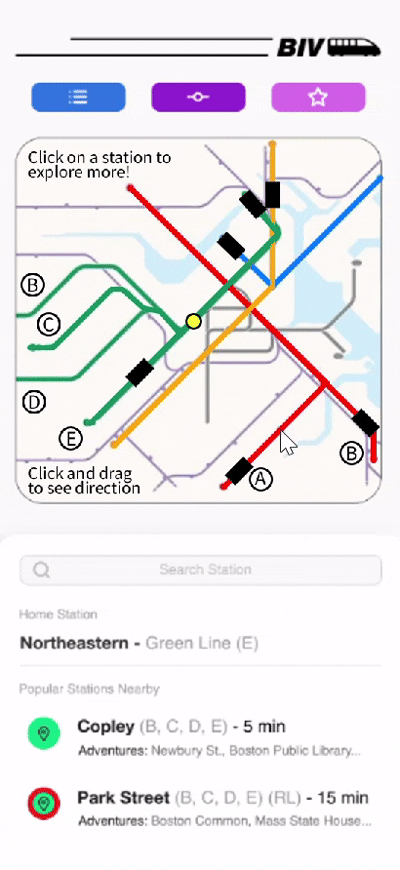
BIV is an app that helps users explore beyond their usual commutes by showing a compressed view of what each T station offers—attractions, history, and local tips.
It cuts planning time, highlights lesser-known spots, and makes discovering Boston easier and more affordable.
Duration
2 weeks, Spring 2025
- - - - - - - - - - - - - - - - - - - - - - - -
Type
UI/UX
- - - - - - - - - - - - - - - - - - - - - - - -
Tools
Figma

Context
Project Brief: Improving the MBTA
As part of my course Processes + Practices, students were tasked with creating an interactive project that improves the experience on Boston's public transportation system – the MBTA (or more commonly called the T).
This could have been accomplished through any new interface that promoted interaction between people and
-
people
-
environments
-
service
-
technology
-
or devices
Research
The MBTA and other Subways
The first step in developing a solution is analyzing the problem at hand.
With sticky notes and a whiteboard, my class went back to basics—writing down every good and bad aspect of our subway system.
Through discussions with my peers, I became particularly interested in addressing how newer students interact with the T. Much like tourists, most students come from suburban backgrounds and are completely unfamiliar with train systems. When arriving in Boston, they want to navigate the city like locals and will always focus on cost efficiency.
Without prior knowledge of the MBTA, newer students are often misguided in their exploration of the city. However, with the right application, I could prevent missed opportunities and confused travel.

Analyzing pain points and best aspects of the MBTA (in class)

Best features found in the top 5 global subways; cited by Essential Living
_edited.jpg)
Outlining elements of the T that could be addressed in my project
Competitor Analysis
There are many navigation and trip-planning apps available. My goal was to identify what competitors do well and where they fall short.
As a student who regularly uses the T for both commuting and exploring the city, it was easy for me to pinpoint the pros and cons of these apps.

MBTA Go

Apple Maps

Wanderlog
Positive Features to Adopt
• Clear visual cues (distinct colors, photos, and mapped distances) support quick understanding
• Accurate wayfinding tools (ex. step-by-step directions and real-time train tracking) show the value of reliable navigation
• Location-aware filtering keeps information relevant and streamlined, which reduces user overload.
• Highlighting nearby points of interest and showing spatial distance adds valuable context
• Credible, review-supported activity suggestions build user trust
Common Flaws to Mitigate
• Prioritize curated, high-level insights rather than dense lists of individual places to avoid overwhelming users.
• Reduce confusion around moving between activities by making transportation guidance simple, intuitive, and not dependent on pre-booked plans.
• Support spontaneous, on-the-go exploration rather than requiring long-term, highly structured trip planning.
• Remove unnecessary back-and-forth navigation by making transit mode selection (especially the T) straightforward and persistent.
• Eliminate the need for users to know station names in advance by guiding them from their current location to the most relevant transit entry point.
Brainstorming and Ideation
Flows, Categories, and Initial Prototype
Drawing from earlier research, I began organizing the information that would best help my users discover new Boston adventures. From there, I mapped out potential page flows and developed an initial prototype to communicate these ideas.

Categorizing the information communicatied through BIV. These categories help users determine their prefered station to explore by accessing diffrent needs (distance, activity wanted, favorite locations, etc).

Page flows for BIV: a helpful reference for future Figma prototyping.

Low fidelity sketches of page views and potential UI icons
First UI/UX Figma prototype

Layout and Navigation
Feedback Received
After presenting BIV's prototype and project narrative to my peers, I received the following feedback to improve my designs:
Typography and Legibility
-
Reduce map size on the Copley info page; use smaller icons and increase white space
-
Create clearer section distinctions to improve navigation
-
Improve legibility of warning text on the Copley page
-
Standardize typography for activity buttons to ensure consistent visuals
-
Explore alternative fonts to better align with MBTA branding
Color and Branding
-
Maintain consistent color usage across visuals and features; avoid reusing line colors for attractions/landmarks to reduce confusion
-
Explore alternative colors and icons to better align with MBTA branding
Icons and Visual Elements
-
Replace “Freight cars” with “T cars” in line graphics
-
Update the train icon to a simpler design and apply full line color for cohesion
-
Reevaluate certain icons (e.g., activities) that may feel confusing or mismatched
Refinement
Before v. After
In response to feedback, I made several key refinements to improve clarity and consistency:
-
Swapped out freight car trains for subway imagery
-
Converted all fonts to Helvetica and Helvetica Neue for consistency (and to match the MBTA’s official typefaces)
-
Increased the size of station names and information bubbles on the Copley page
-
Replaced real-world images on the activities page with representative icons, aligning with the icon style used on the station map
-
Adjusted map icon colors so that vivid color associations were reserved exclusively for T lines
These updates strengthened overall design cohesion while also improving navigation and building user confidence in the platform.

Comparing the First and Second Layouts


Reflections
Expanding the Prototype
This project pushed me to learn Figma quickly and work within a tight timeline, shaping my first experience in UI/UX prototyping and visualization.
If expanded further, I would include more content (line, activity, and station pages), add new features (home station dropdowns, favorites, fare details), and enhance maps with zoom functionality.
Regardless, BIV's current model aligns with the mission to provide a personalized, flexible guide for any MBTA rider across Boston.

Extension
Animating in Python:
1 week, Fall 2025
As part of my Prototyping with Code course, I expanded my earlier BIV prototype by applying Python in Processing. Having never coded before this semester, this project marked my first self-directed Python project.
Scope:
- Animate trains on the home screen map
- Trigger a transition when a user directly clicks into the map to enter a station’s page
- Allow the user to drag across the map to see which direction of Boston they want to go.

Low-fidelity visualizations of scope
The functions I implemented translated my design intentions into functional behaviors using loops, conditionals, and coordinate-based logic.
Results:
-
I strengthened my ability to prototype interactively
-
I applied newfound software skills to a large-scale challenge
-
I advanced my original design intent to create a more engaging user experience
© 2025 Mayah Hamaoui.